Mike Harris FBCS delves into statistical process control charts and discovers how they have been helping us make sense of data, spot patterns and make decisions for more than 100 years.
A control chart is a statistical tool used in quality management to monitor and maintain process stability. It graphically displays variations in a process over time, helping identify trends, patterns, and potential issues for timely intervention and improvement.
In these days of AI, data science and visualisations, control charts might seem like a new idea. But, that’s very far from the truth. On Friday, 16 May 1924, Walter Shewhart gave his manager at Bell Telephones a memo suggesting a way of using statistics to improve the quality of telephones, and that included ‘a drawing of what may have been the first control chart’. Walter Shewhart sparked ‘a revolution in quality control’.
Statistical process control charts (SPC) are now used to gain insights in many ways, such as the personal range health data on a Fitbit.
100 years of insight from control charts
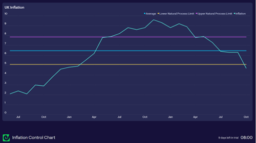
An example control chart is shown above. ‘A control chart begins with a time-series graph. A central line is added as a visual reference for detecting shifts or trends, and control limits (computed from the data) are placed equidistant on either side of the central line’.
The control limits are calculated from the variation in the time series data and ‘define what the process will deliver as long as it continues to operate as consistently as possible. This is why control charts are described as the voice of the process’.
If a manager or team uses control charts to analyse their process, they can see the effects of the changes they make to their system.
Faults that cause the time series to go outside the control limits on the chart are said to have a particular cause. Faults on the time series that are within the control limits are said to have a common cause. We should interpret ‘faults of the system as common causes of trouble and faults from fleeting events as special causes.’
‘A process that is in statistical control when it no longer has special causes. The performance of a process that is in statistical control is predictable’. The above control chart shows that UK inflation had notable cause faults and was not in statistical control.
Every product has qualities. Examples of qualities that a product may have are performance, accessibility, testability and security. Some of these qualities, such as performance, are objective and measurable and can be analysed on a control chart. Analysing the data from performance tests in a control chart would show whether faults are special causes or common causes.
Using Control charts
In 1924, control charts gave managers, for the first time, a tool for managing the uncertainty in production. It gave them a tool to track variation, which enabled managers ‘to understand better why the production line creates defects’.
Managers could now ask why one production line produced more defects than another. They could also look at the production system and consider how raw materials, training, and other issues affect the quality of products coming off the production line. Managers could feel what the variation shown in the chart is trying to say about the process and how it affects their staff.
Before SPC charts, quality assurance would typically consist of an inspector checking products as they came off a production line and putting substandard products in the trash or sending them for rework. Staff on the production line would be blamed for poor quality products. The use of control charts enabled managers to find the causes of failures. Instead of blaming the workers, managers could use systems thinking to improve the quality of products being developed. Control charts ‘enabled management to see defects as results of the process instead of the workers’. Managers could become leaders who coached and counselled staff rather than remaining as managers who judged their staff.
For you
Be part of something bigger, join BCS, The Chartered Institute for IT.
Walter Shewhart also created a cycle that could be used to learn from the faults. Deming included what he called the Shewhart Cycle in his lectures in Japan in 1950, and it came to be known as the Deming Cycle. This cycle enables managers and teams to use the feedback from the failing process to make improvements. The cycle has four parts: plan-do-study-act. Using the cycle, managers can plan an improvement, then ‘do’ the improvement, then study the effects of the improvement, and then act on what they have learned. This cycle can be used to take the insights from control charts and use the insights to make continual improvements.
The cost of recalling cars with faulty brakes is much greater than using control charts to analyse production. Using control charts meant it was now cheaper to produce quality than fix faulty products.
100 years of control charts
We now have 100 years of insight from control charts. They are now widely used; for example, they are used in DevOps governance, analysis of unit testing, load testing, customer support, health care, nuclear power, car manufacturing, education, managing stock levels, marketing campaigns and other processes.
Walter Shewhart’s memo introduced the use of control charts to improve the quality of products. A century later, control charts are used in many industries to improve quality. ‘Millions of people have proven, by their own experience, over the years, that Shewhart’s control charts work. This approach to understanding and using data is not on trial.’ Using control charts to analyse your processes will give you insights into your business.
I use the information in the book Understanding Variation: The Key to Managing Chaos by Donald J. Wheeler and Geckoboard Datasets API to create control charts.
A good source of further learning about control charts is the YouTube video Profound Book Club Control Charts by Dennis Sergent.